CHEMISTRY :
Misc Docs & Projects
Colour Charts
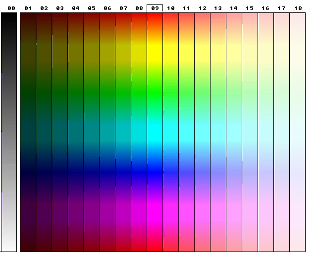
Here are few colour charts which can be used as a standard colour reference guide. Their function comes when one comes to describe a colour produced in a reaction with words. Sometimes it is not enough to say a blue colour was produced, since there are many hues and shaeds of blue, from indigo to torquise and each from light/pastel-like to dark colours.
Hence thanks to the colour charts below, one can compare the colour produced in the reaction against the charts, and hence get a specific code to the best colour match. The colour code can then be the result report, for example - "the reaction produced a light blue (Code B12 on Chart 2) precipitate."
The following charts has been produced:
Chart 0:
A blank chart, for further use,
Chart 1a and Chart 1b.
Two charts of the same design and presentation but with different colours.
Chart 2:
Completely different design, which is more efficient, easy to use, and more colours present.
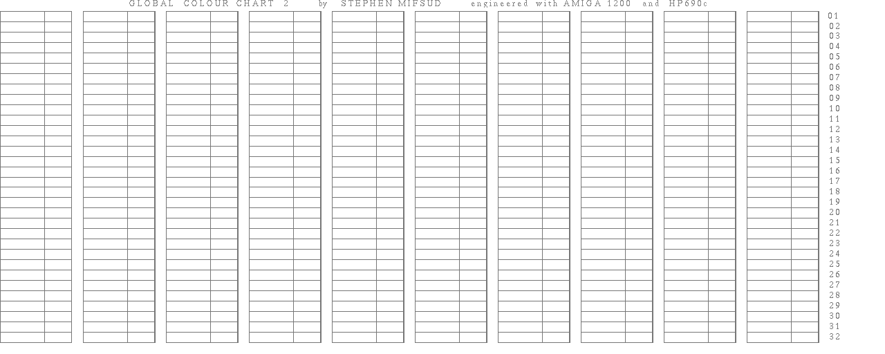
COLOUR CHART 0:
This is an empty chart which can be fileld with custumized colours and specific codes. Each cell (box) represents a particular colour. The colour is filled in the wide box, while the specific code in the adjecent smaller box. Chart 1a and 1b shows how it can be used.
COLOUR CHART 1A
Here you find a wide range of colours followed by an empty small box. In this box one must put a particular code specific for each colour. It is left blank so that one can customize his own colour codes as he likes. The reaction colour or other in-vivo colour is compared with the colours in the chart and the code of the colour which is the most matche is noted (eg used to describe the colour produced by a reaction)
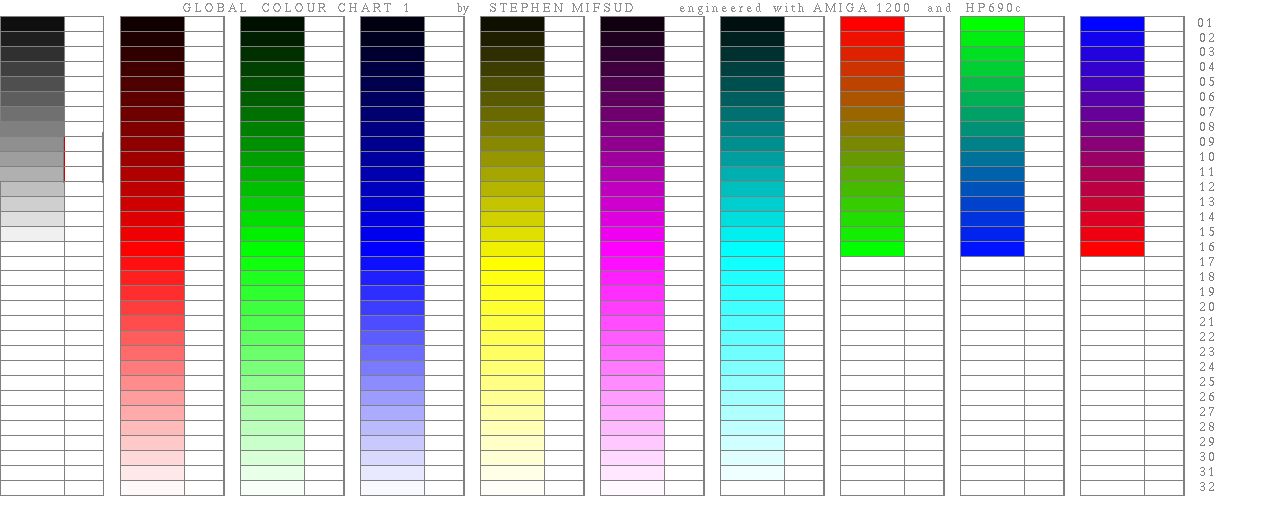
COLOUR CHART 1B
Same as chart 1a but different pastel-like colours are used. Different codes from the charts above should be obviously used.
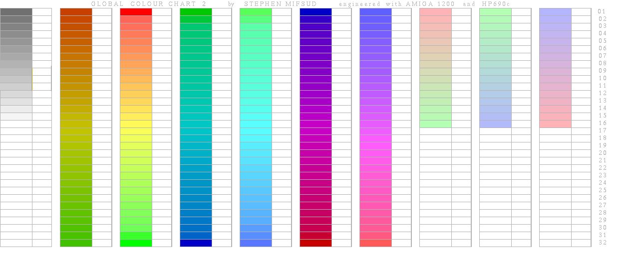
COLOUR CHART 2
This is a differently designed chart, and propably more flexible and efficient. With a scaled ruler a horizontal line is marked in 19 scales numbered 0 - 18 over (or below) the chart. The vertical axis is not marked and a ruler is used to find the vertical distance from the baseline which gives the most precise colour match. The distance in mm can be used to give the vertical co-ordination.
For example if the chart height is 100mm (10cm) a light yellow colour will be 17,80 (Band 17, 80mm from base) while navy blue will be 01,30 (approximately)
Another idea is to label the horizontal axis with letters hence A - T, so the the results will look something like T80 (for the light yellow) and A30 (for the navy blue).
One can also draw horizontal and vertical lines equally spaced from each other (typically 1cm) to form a grid on the chart. The Horizontal axis is marked A-T while the Vertical in numbers so as each cell has its co-ordinate alpha-numerical code (Like in spreadsheets). The colour on the chart which matches best the vivo colour could hence be found by the co-ordinates without the need of a ruler.
Chemistry Section Links
[ Chemistry Main Page ] -
[ Qualitative & Quantitative Analysis ] -
[ Pyrotechnics ]
[ Cation ID ] -
[ Chromatography ] -
[ Crystal Study ] -
[ Misc Documents ] -
[ Chemistry Index Page ]